
There are a handful of people in the world who really get how to put the right typefaces together in just the right way to make something really beautiful out of plain boring letters, words, and sentences. My good friend Doug Wilson belongs to that select group and he’s got the resume to prove it. I asked Doug for a quick lesson on one of his favorite subjects to try to help the rest of us understand the art and science of text a little better.
What is typography?
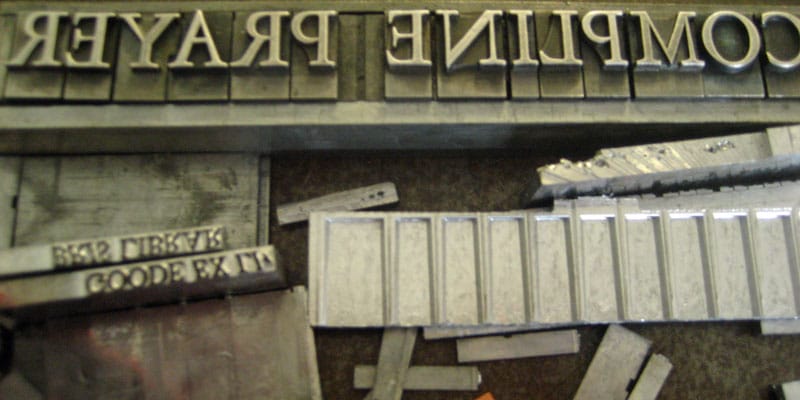
Typography is the study of letterforms and text. It is strange, but I just love looking at letters all day long.
If there were 3 type-related mistakes you could magically keep everyone from making in their documents, presentations, and websites from now on, what would they be?
1 – THINK about the typeface (the correct term for a font) you are using. Don’t use the default typeface of 12 point Times New Roman or Arial just because you are lazy.
2 – Don’t center text unless it is a headline on a poster. Centering text is something your mom does in Microsoft Word and it is a pain in the ass to read.
3 – Friends don’t let friends use Comic Sans. Unless you are making a comic book, just say no. (Nate: Especially don’t use Comic Sans if you are making a comic book.)
The biggest common problem is starting with 12 point for text. It is always too big. I’m not sure why Word sets 12 pt. as a default, but 10 pt. is much more manageable and, unless you are writing for your grandparents, you don’t need it so big.
Besides those three things, what are some of the basic principles of using type, either in print or on screen?
When designing something, keep it simple, stupid. Don’t use star bursts and drop-shadows and crap like that. If you can do it in Powerpoint, don’t. Keep your color palette to one or two colors. Black and red is one of the most classic and powerful combinations and many times, less is more.
For people who are happy to ‘fake it ’til they make it’, can you give an example of a template they can use in most situations so that type geeks don’t make fun of them?
I would suggest finding a typeface family that you like then learning to master it.
Body text alternatives to Times New Roman:
* Adobe Garamond,
* Caslon,
* Baskerville,
* Hoefler Text (a gorgeous Mac default font),
* Scala.
Sans-serif alternatives to Arial:
* Helvetica,
* Gotham,
* Frutiger,
* Univers,
* Gill Sans,
* and Scala Sans.
For others who want to delve deeper into the art and science of typography, what resources would you recommend?
The best resources for good typography are:
- I love Typography – you can learn good type by seeing good type in use
- ‘Thinking with Type’ by Ellen Lupton – a great beginners book that I assign to all my basic typography students
- ‘The Elements of Typographical Style’ by Robert Bringhurst – the Bible of type
A while back, Doug Wilson directed a film about an old machine (and its operators) used by newspaper companies all over the world to quickly print typographically pretty blocks of text, over and over and over again. The film he made is called Linotype: The Film.
Find out more about Doug and his work, or follow him on Twitter.